Instructions for the smaller, weekly assignments. These should be posted to the class website — categorized appropriately.
Assign #1. Online Introductions (due on site by midnight 8/23)
- Write a brief introduction of yourself (250-300ish words).
- Then add a few visuals that tell us something about you — what do you do? what are your values? what’s important to you? what do you really, really like?
- Finally, add a mug shot — a small head shot photo that shows your face.
Assign #2. InDesign Tutorials
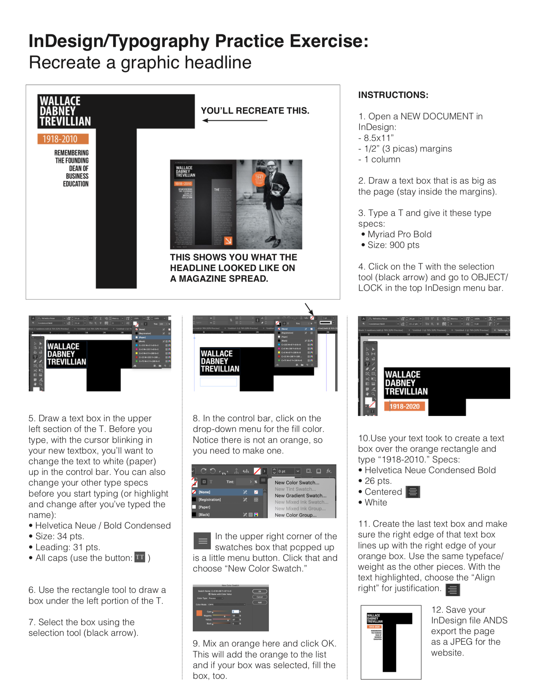
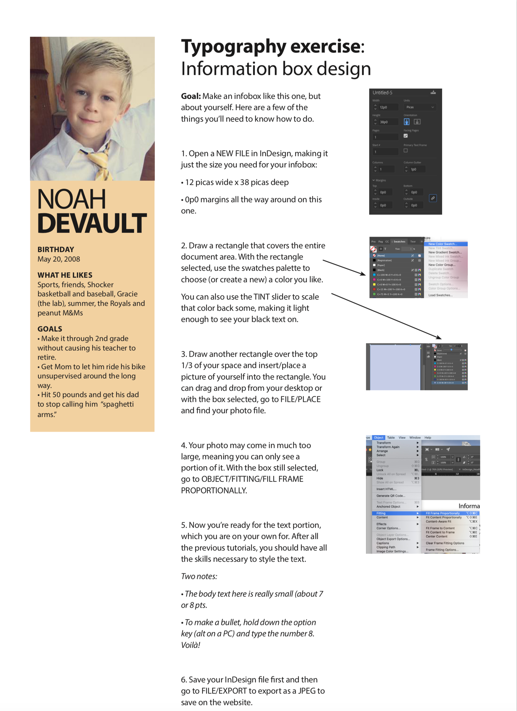
Assign #3. Headlines & Infobox (InDesign practice)
There are three tutorials to complete and post for this assignment. The first two involve recreating stylized headlines and the third is creating an infobox — a little bio box to be more specific. None of these require you to download any files. For each, you’ll just start with a new InDesign document (the instructions tell you what size for each one).
Click the thumbnails to get the larger instructions file for each one:
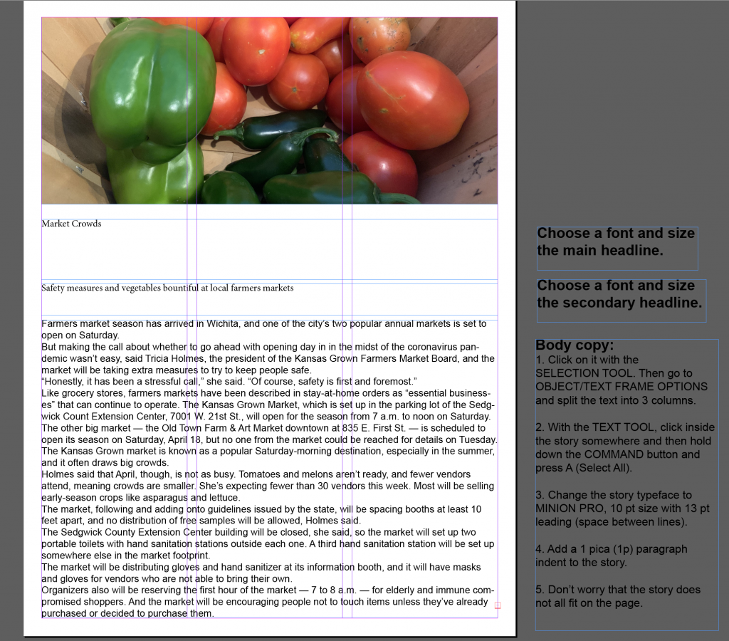
Assign #4. Typography Practice
There are two parts to this assignment. You’ll need to download this folder, which includes one InDesign file for each part.
4a. Open the InDesign file called “Type Practice 1.” In this one, you are simply styling two headlines (a main headline and a secondary headline) and formatting a story to practice choosing and styling text. The exact instructions are off to the right of the page in the InDesign file. When you open the InDesign file, it should look like this:
4b. On the second one, you will redesign this postcard advertising a fundraising event. You will rely almost only on typography. As it is, there is no hierarchy, the text is difficult to read, and the text is on top of a busy background. In the download folder, you will find a graphic (jpeg file) and the text (Word doc).
Open a NEW file in InDesign: 5″ x 7″ (make sure you have it set to inches) with .25″ margins all the way around. Start by placing the graphic on the page.
Read the text first, then group it correctly. Make sure your postcard has a true headline. You may need to write one. Then help the reader scan by using the size and weight of the text. Organize and prioritize information!

A few rules/parameters:
- You may use only ONE typeface. You may use various weights of that typeface.
- Other than the graphic, no color — only black text
- No special effects (such as drop shadows)
- No lines or shapes except for the provided graphic
Turning in your assignment:
- First, make sure you’ve saved your two files each as InDesign files first.
- Then for each one, go to FILE/EXPORT and choose JPEG as the format from the dropdown menu.
- When the JPEG export dialogue box pops up, change the quality to HIGH and the resolution to 300.
- Finish the export and post the two JPEGS in one post on the website.
NOTE: The website will NOT let you upload/post an InDesign file. Make sure you are choosing the JPEG files and not the InDesign files.
Assign #5. Color
For this assignment, I’ve created a slide deck that walks you through the assignment, including a few InDesign techniques you’ll need to use. Please don’t skimp on time when going through these slides. They’ll make the assignment both easier and more worthwhile for you. Toward the end, you’ll find examples from past classes, too, which gives you a clear picture of what you are trying to do. Have some fun with this assignment, and please choose a brand that you are able to define a color scheme from.

Assign #6 (Photoshop tutorials)
On weekly rundown.
Assign #7 (Shoot a good photo)
Using your phone, consider what we talked about in class and the many examples we looked at. Take a stab at shooting a “good photo” that has all three elements talked about in class: good composition, good/interesting light and emotion. You might shoot 30 photos (or more) to get the best/right angle, light and composition.
This should be a NEW photo. Don’t browse your photo library for something you think will work.
Post your photo.
Assign #8 (Find a news photo you really like)
Find a photo shot by a photojournalist in the last three weeks that you like — caught your attention. Post it to the website. Give the name of the photographer and where you found it (a link to it would be great) along with two reasons you think it’s a great photo.
Some ideas for news websites to look at:
- Kansas.com (The Wichita Eagle)
- KansasCity.com (The Kansas City Star)
- Associated Press — search “photos of the week”
- MSNBC — search for “week in pictures”
- BBC — search “in pictures”
Assign #9
Two parts: Mr./Ms. Veggie Head and Cutout Photo Graphic — I’m going to give you 10 points for each of these this week, but you can post them together in one post (Assign 8: Photoshop Selections)
The instructions are on two PDFs you can see/download here:
And here are the photo files you’ll need for the two assignments:
Assign #10
Recreate ONE of these three magazine spreads, to help you practice using columns/grids and to get a sense of best placement for images, text and white space.
Steps:
1. Choose ONE of the three layouts below: 3-column layout, 5-column layout or 10-grid layout.
2. Open an InDesign document (use the page specifications shown for each layout).
3. Create a “dummy” in InDesign (gray boxes and filler text) that replicates the layout you chose. Just follow the dummy layout shown on the page.
4. Then start filling in the content. Get close on the typefaces (but it doesn’t have to be exact).
Download the photos and sidebar text here:
5. Use filler type type (Type/Fill with Placeholder Text) for the story.
6. Export a jpeg of your layout.
IMPORTANT NOTE: When you are exporting, make sure you check the “spreads” item in the export dialogue box. Otherwise, it won’t export your pages side-by-side.
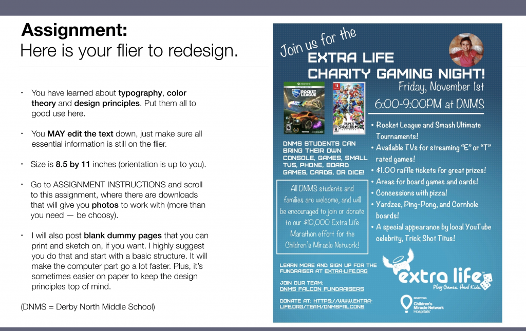
Assign #11
Task: Using all typography, color and design principles discussed in class so far, redesign this flier:
Size: 8.5″ x 11″ (can be portrait or landscape)
You may also create your own art or take your own photos.
Save your file as an InDesign file first so you can go back and make changes later. Then EXPORT as a JPEG (High Quality and at least 200 resolution) and post on the class website.
Here’s a slide from the class lecture:

Your recent comments